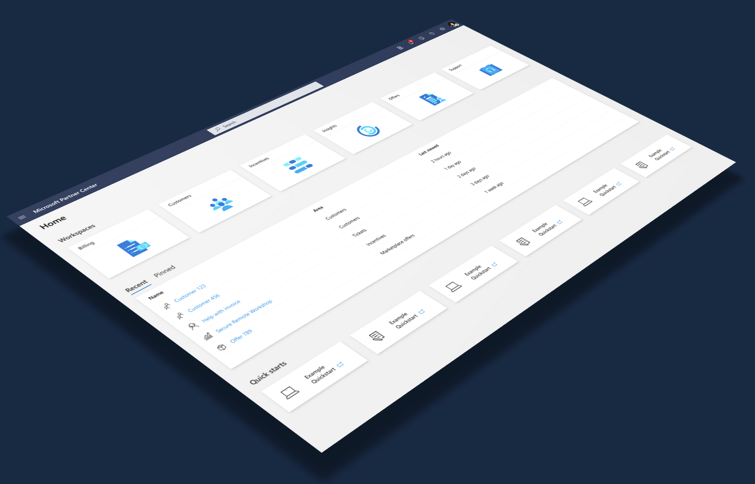
Raising the bar for UX quality across Microsoft Partner Center
A January design sprint that grew into the components, templates, and certification standards for Microsoft Partner Center.
Role: Design Manager, team of 4 | Org: 750+ product and engineering, 14+ programs | Timeline: January 2020 sprint; program still running when I left | Deliverables: Modern component library, page templates, canonical workflows, UX performance standards, UX certification program
Partner Center outgrew its design.
Partner Center is where organizations manage their product business with Microsoft. Game publishers, commercial software developers, and resellers spend significant time in the portal, supporting hundreds of billions of dollars in revenue. It evolved from the Windows App Dev Center into dozens of programs, and the growth showed. Partners put it best:
"Feels like a bunch of portals that were jammed together to put under one roof. But they don't seem to have a lot in common with each other."
The design language was a generation behind the rest of Microsoft B2B offering, and the programs didn't even match each other. The user goal: transfer knowledge between contexts and learn new workflows without pain. The business goal: raise Partner confidence and satisfaction enough to keep scaling the platform.
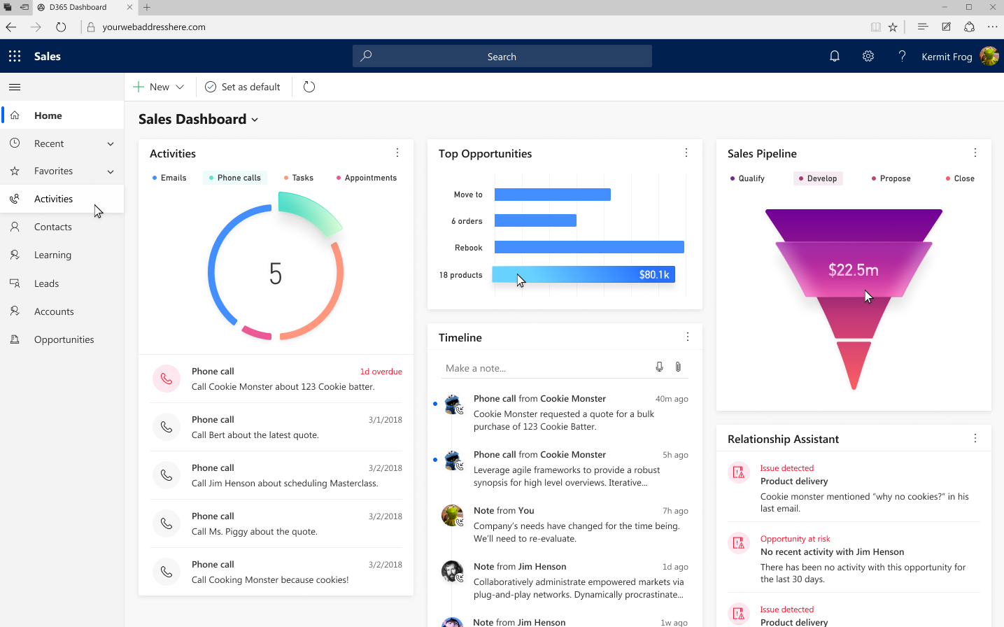
M365
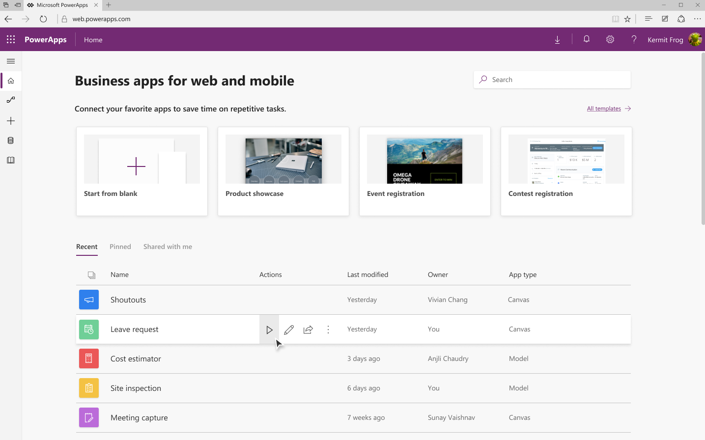
PowerApps
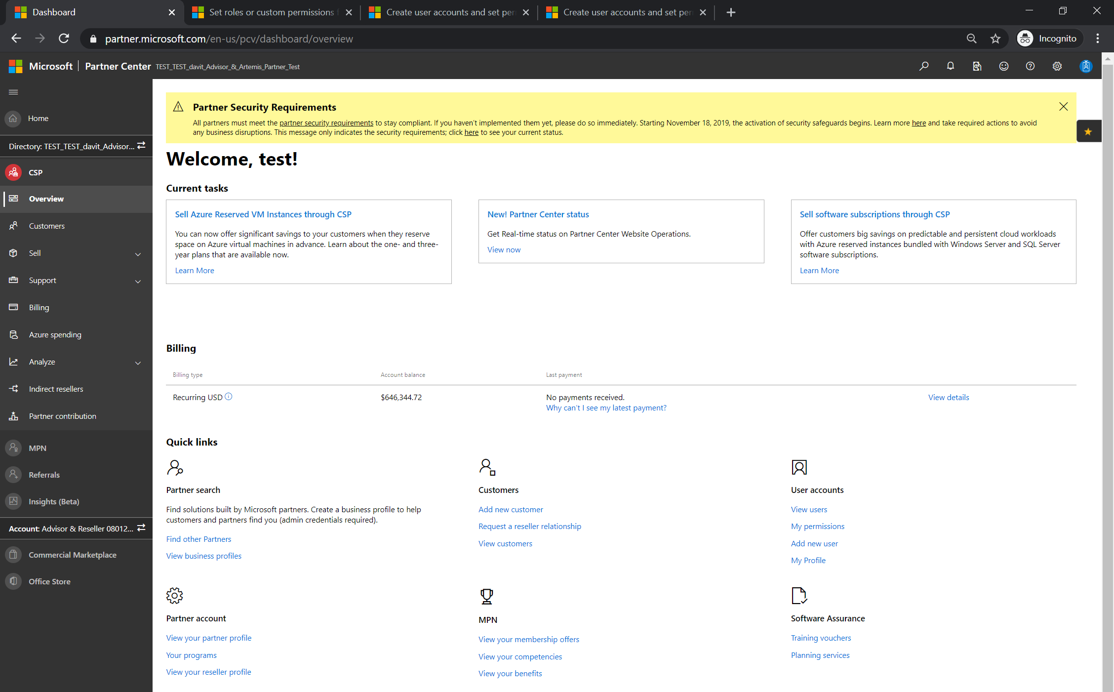
Partner Center
We needed to work smart and not boil the ocean. And other cliches.
My design team was four people, including me, working with a product and engineering org of 750+. Through accumulated research and our own heuristic evaluations, we picked three focus areas: UI consistency (partners work across Microsoft tools, and ours looked like the odd one out), navigation (heavy, and it pulled attention away from the work area), and usability (overloaded elements that didn't scale to the amounts of data and types of workflows partners handle).
The principles that kept us honest: WCAG 2.1 accessibility, which besides being a legal requirement is a moral responsibility. One brand identity spanning product and marketing (which are in separate organizations). Design efficiency, meaning we adapt what the company has already built instead of reinventing the wheel. And perceived performance, influencing performance fixes where we could and designing for how fast it feels everywhere.
The sprint I could only have scheduled in January.
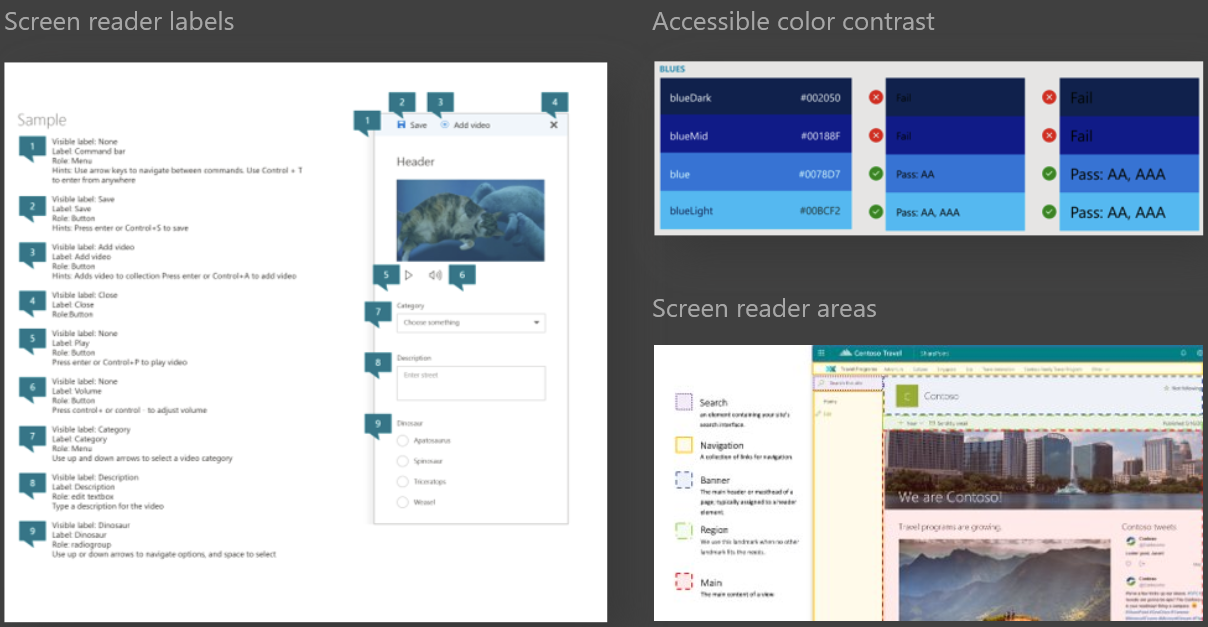
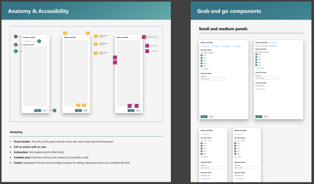
I took the team offline for a week-long design sprint and invited designers from other productivity portals. The timing mattered for two reasons: starting the year with something creatively invigorating, and knowing I could get away with the whole team disappearing while our PM counterparts nursed their holiday hangovers. We were joined by a designer from another B2B product at Microsoft and a front-end developer.
The output was several high-value workflows reimagined under the new principles, a proposed brand color tying the portal to the partner marketing sites, and recommended next steps. That presentation became the roadmap.
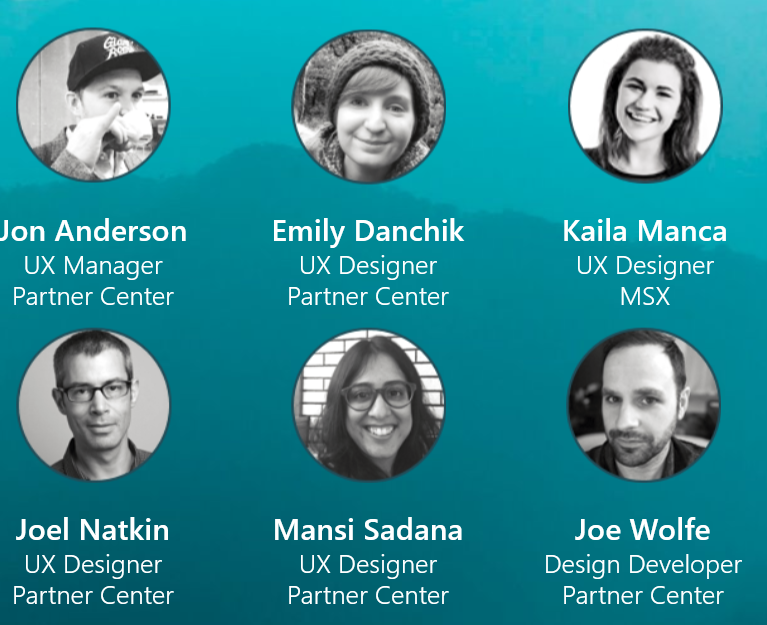
Modern components: meet the standard.
Many UI elements served unclear purposes or were used incorrectly, and several fell apart at Partner Center's data volumes. We drafted new components with best-practice guidance in the design toolkit and framework documentation, so designers and developers could move at higher velocity and quality.
Page templates: scale faster.
We inventoried every page in the portal, tallied the layouts, and built templates for the most common types. The overview template establishes clear hierarchy so partners can scan for what needs their attention, with calls to action that are actually actionable. The table template optimizes density for productivity and moves commands next to the rows they act on, with multi-select and bulk actions wherever possible.
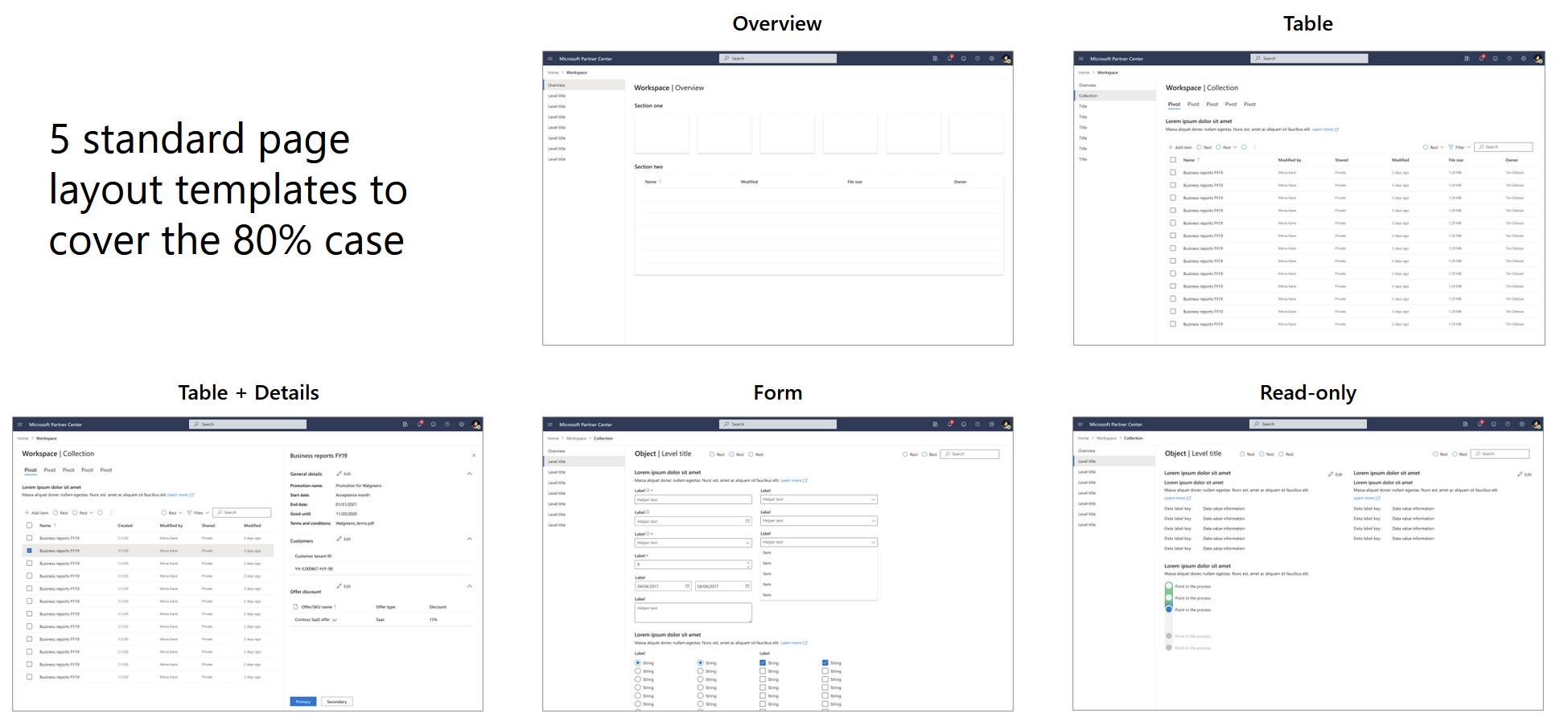
The overwhelming majority of pages fell into these five categories.
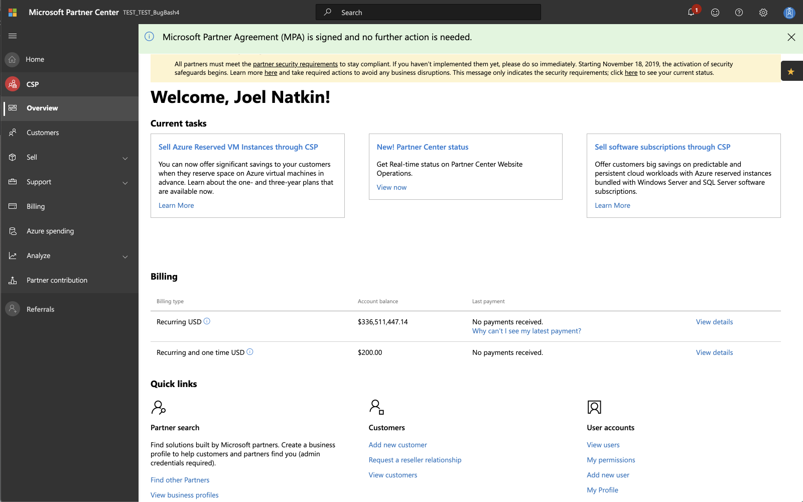
Overview - before
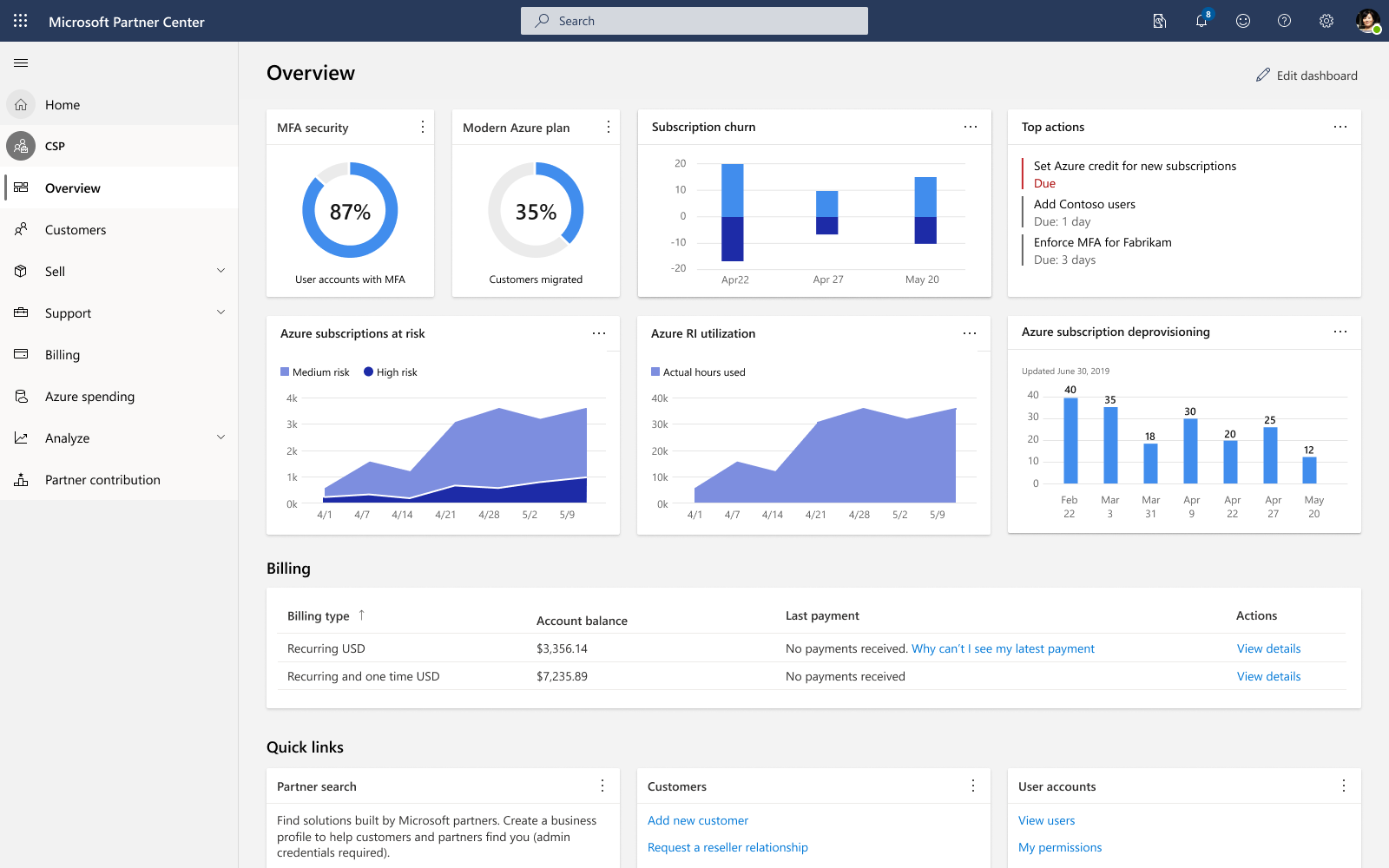
Overview - after
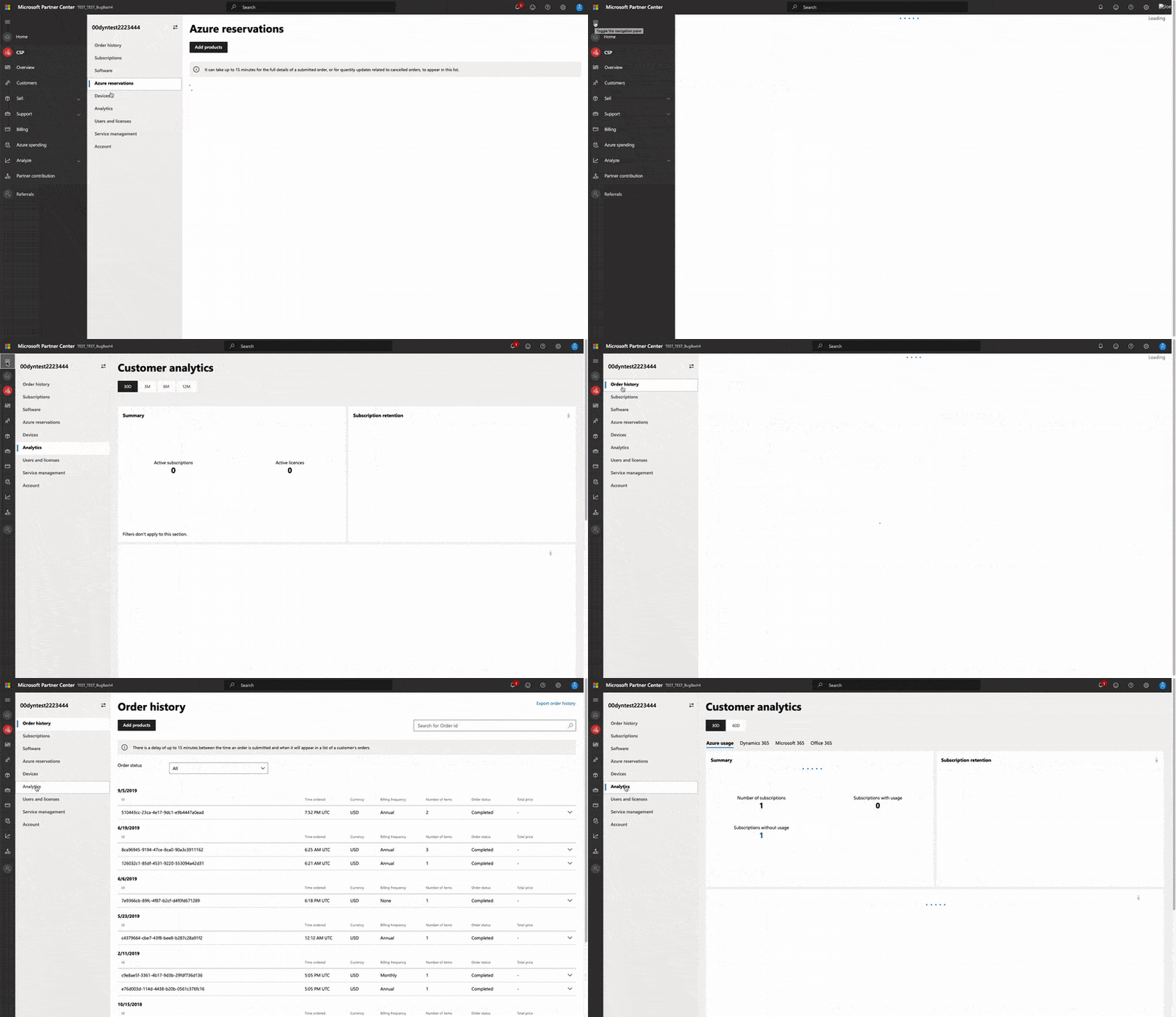
Page transitions - before
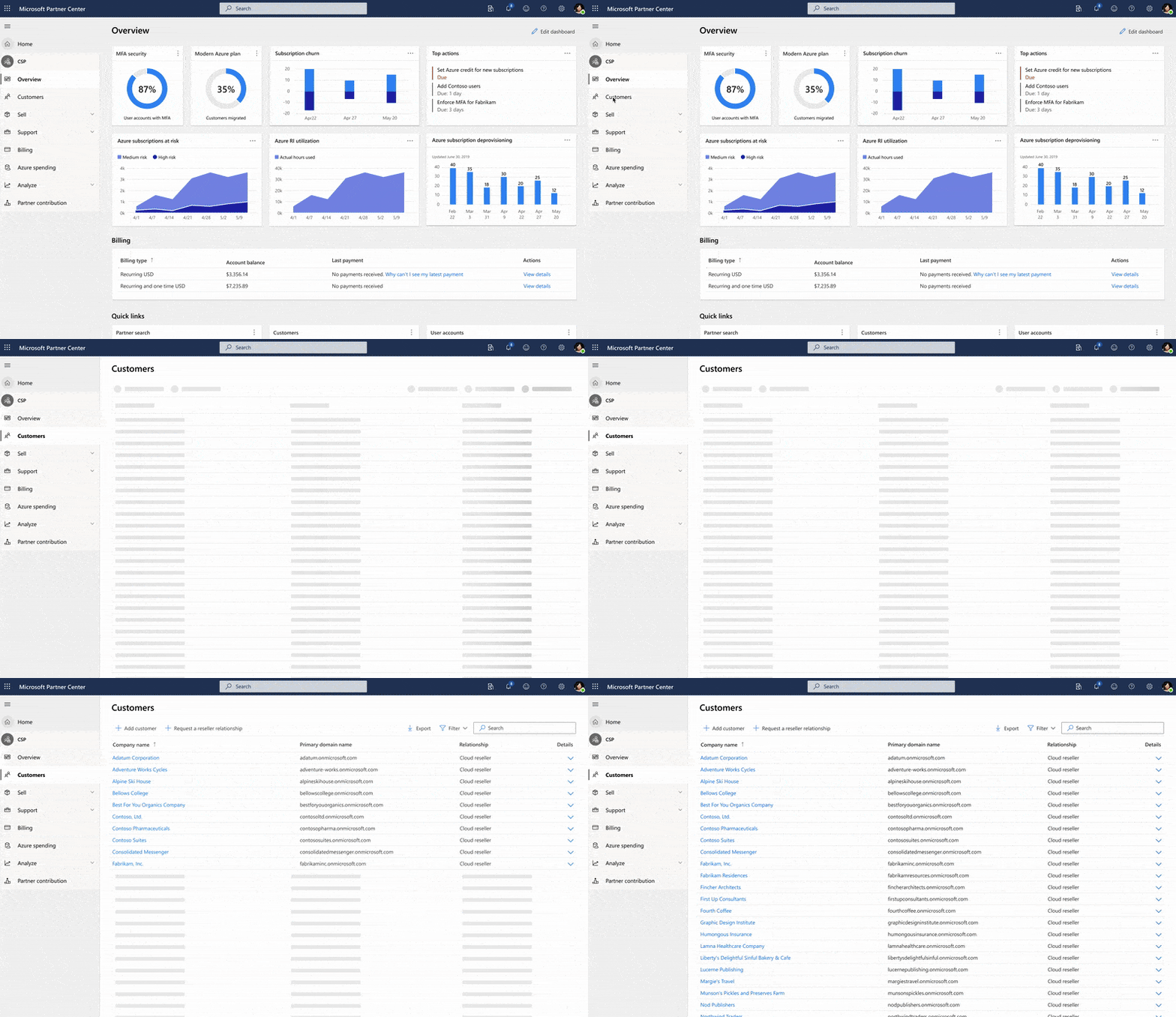
Page transitions - after
Navs shouldn’t dance.
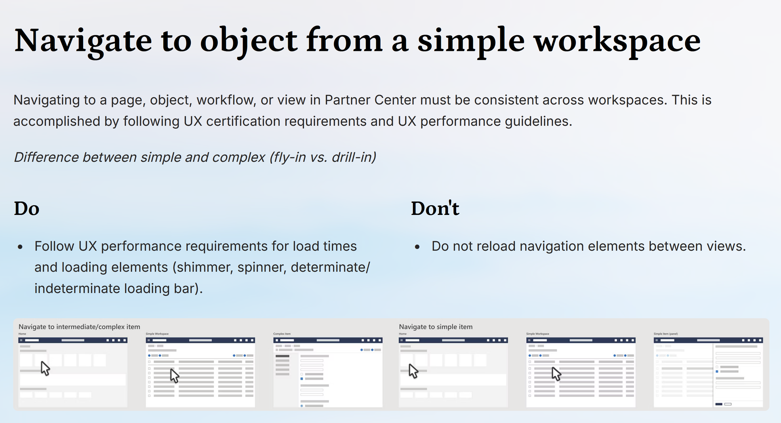
Loading was inconsistent: sometimes the entire nav reloaded, sometimes part of it, sometimes with no feedback at all. A dancing nav. The deeper problem was its representation of the information architecture. The nav is where the portal's hierarchy lives, and every reload redrew it, so partners lost their sense of place in the exact element that was supposed to provide it.
We rebuilt how that hierarchy gets presented. Each layer of navigation now holds fixed while only the content area loads, so the structure stays put while the work changes, and skeleton shimmer fills the wait so there's never a dead screen. The response targets came from UX performance standards I wrote grounded in brain physiology: to keep users in a state of flow, responses need to land in the 2 to 5 second range.
Canonical workflows: the same task works the same way everywhere.
Creating, editing, deleting, navigating, importing: the most common tasks now behave identically across workspaces, documented as do/don't pairs (do make Cancel the primary button on destructive actions; don't reload the nav between views). Complex publishing, like an Xbox game or a commercial marketplace offer, follows a modular flow where a setup step collects the user's intent and only the relevant modules appear, a pattern that started life in Project Jaguar.
Certification: how quality survives 14+ programs.
Templates don't enforce themselves. With 14+ programs and a rotating cast of teams, product leadership and I introduced UX certification: guidelines, requirements, and a scorecard that grades each program's experience against the standard. Getting executive buy-in for something this size required top-down shifts in priority, which is its own design problem. The plan was to stagger certification and tackle the highest visibility programs first, with the other programs to follow.
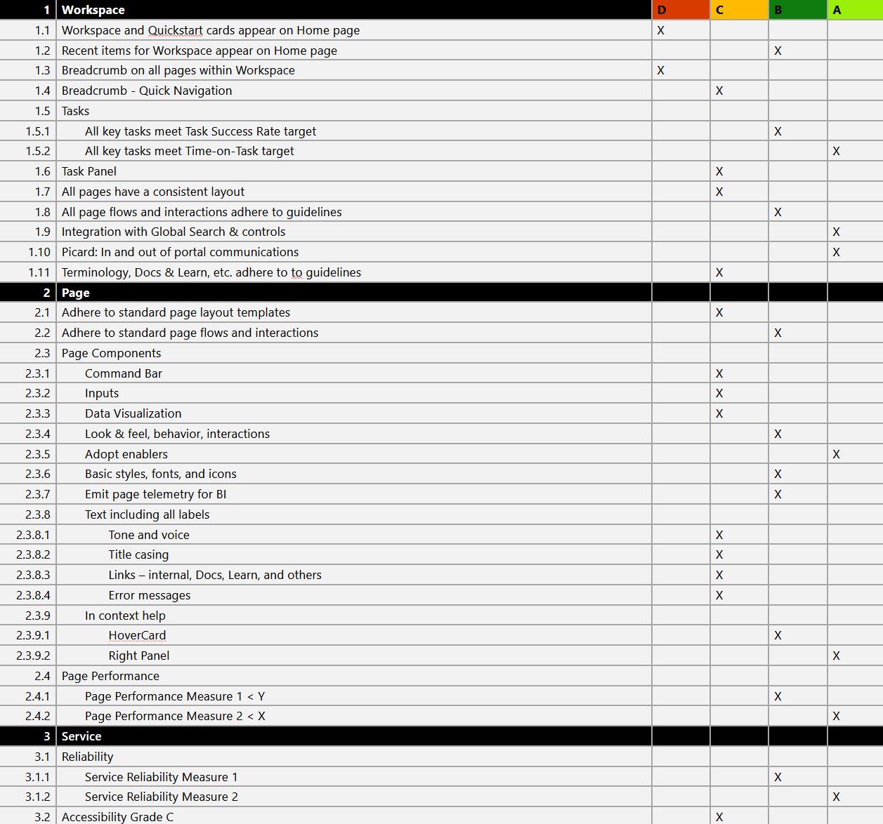
Certification criteria
Results.
+1.1 point partner satisfaction improvement across the programs under active revamp
Top 3 revenue programs entered certification and were working toward B-level scores
Every accessibility bug closed in those three programs
Most of the 14+ programs committed to adopting the templates
Across 10 partner workshop sessions, the consistency push was received positively and none raised change management concerns
The longer-term impact was the operating model. What started as a fun January project shifted the design team from feature-focused to foundational, and unlocked the navigation and IA overhaul, onboarding standardization, contextual help strategy, and more. It was all still running when I left.